How to Add Form Validation to Your Tailwind CSS Contact Form
In this tutorial, we will explore how to enhance your Tailwind CSS contact form with form validation using Peer & Invalid Sibling States. By implementing these techniques, you can ensure that users provide accurate information before submitting the form.
Adding form validation to your contact form is crucial for improving user experience and data accuracy. With Tailwind CSS and the Peer & Invalid Sibling States approach, you can create visually appealing and functional validation messages that guide users to correct any errors before submission.
Here's a live demo: Tailwind CSS Form Validation
Step 1: Set up the HTML Structure
Begin by creating your contact form with the necessary input fields. Make sure to include the required attribute for mandatory fields and assign unique name attributes to each field.
<form id="form" novalidate>
  <input type="text" name="name" required placeholder="Name*" />
  <input type="email" name="email" required placeholder="Email*" />
  <textarea name="message" required placeholder="Message*"></textarea>
  <button type="submit">Submit</button>
</form>
Step 2: Add Tailwind CSS Classes
Next, apply Tailwind CSS classes to each input. For sanity, we have removed other classes to focus on the validation part. Here's an example of how to style the input fields:
<div>
    <input
      type="text"
      name="FirstName"
      required
      class="peer border-2 focus:ring-2 [.validated_&]:invalid:border-pink-600 [.validated_&]:invalid:ring-2 [.validated_&]:invalid:ring-pink-200"
      placeholder="Name*"
    />
    <p class="mt-2 hidden [.validated_&]:peer-invalid:block text-pink-600">
        Please provide your first name.
    </p>
</div>
Here's what's happening in the code:
- We've added the
peerclass to the input field and the sibling paragraph element to establish a peer relationship. - The
border-2class adds a border to the input field. - The
focus:ring-2class adds a ring on clicking the input field. - The
[.validated_&]:invalidselector applies styles to the input field when it is invalid. - The
.validatedwill be class name we will add to the<form>element when the form is submitted (using javascript). More on that later. - The
border-pink-600class changes the border color to pink when the parent has class.validateand the input field isinvalid. - Now, the
peer-invalidclass will be added to the input field when it is invalid. This will make the sibling paragraph visible.
Here's another example for the email input field:
<div>
    <input
      type="email"
      name="email"
      required
      class="peer border-2 focus:ring-2 [.validated_&]:invalid:border-pink-600 [.validated_&]:invalid:ring-2 [.validated_&]:invalid:ring-pink-200"
      placeholder="Email*"
    />
    <p class="mt-2 hidden [.validated_&]:peer-invalid:block text-pink-600">
        Please provide your email.
    </p>
    <p class="mt-2 hidden [.validated_&]:peer-[:not(:placeholder-shown)]:peer-invalid:block text-pink-600">
        Please enter a valid email address.
    </p>
</div>
Here, we've added an additional paragraph element to display an error message when the email field is empty or contains an invalid email address. The [.validated_&]:peer-[:not(:placeholder-shown)]:peer-invalid selector applies styles to the input field when it is invalid and the placeholder is not shown.
Step 3: Implement JavaScript Validation
Finally, add JavaScript to validate the form fields and display error messages when necessary. Here's an example of how to achieve this:
<script>
  const form = document.getElementById("form");

  form.addEventListener("submit", function (e) {
    e.preventDefault();
    form.classList.add("validated");
    if (!form.checkValidity()) {
      form.querySelectorAll(":invalid")[0].focus();
      return;
    }
    // Submit the form
  });
</script>
Step 4: Test and Refine
Test your form by entering valid and invalid data. Ensure that the validation messages are displayed correctly and that the form submits successfully when all fields are valid. Refine the styles and validation messages as needed.
Here's the final code (with form submissions using Web3Forms API):
<!--
// This is a working contact form.
// You can get your access key from https://web3forms.com for free
-->
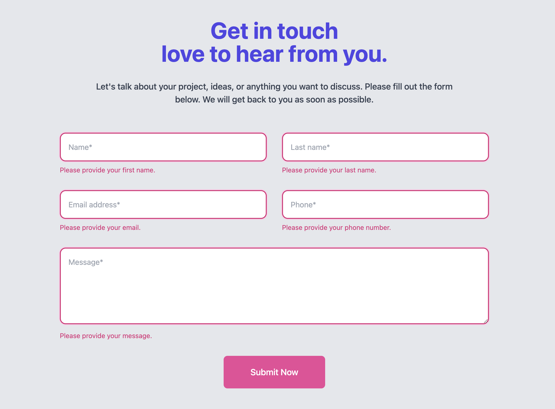
<form action="https://api.web3forms.com/submit" method="POST" id="form" novalidate>
<!-- Add your access_key here -->
<input type="hidden" name="access_key" value="YOUR_ACCESS_KEY_HERE" />
<input type="checkbox" class="hidden" style="display:none" name="botcheck" />
<div class="grid md:grid-cols-2 gap-8 max-w-4xl mx-auto mt-14">
<div>
<input
type="text"
name="FirstName"
required
class="peer border-2 border-muted-medium py-4 px-4 rounded-xl placeholder:text-default focus:border-primary focus:ring-1 focus:ring-primary outline-none w-full [.validated_&]:invalid:border-pink-600 [.validated_&]:invalid:ring-2 [.validated_&]:invalid:ring-pink-200"
placeholder="Name*"
/>
<p class="mt-2 hidden [.validated_&]:peer-invalid:block text-pink-600 text-sm">
Please provide your first name.
</p>
</div>
<div>
<input
type="text"
name="LastName"
required
class="peer border-2 border-muted-medium py-4 px-4 rounded-xl placeholder:text-default focus:border-primary focus:ring-1 focus:ring-primary outline-none w-full [.validated_&]:invalid:border-pink-600 [.validated_&]:invalid:ring-2 [.validated_&]:invalid:ring-pink-200"
placeholder="Last name*"
/>
<p class="mt-2 hidden [.validated_&]:peer-invalid:block text-pink-600 text-sm">
Please provide your last name.
</p>
</div>
<div>
<input
type="email"
name="email"
required
class="peer border-2 border-muted-medium py-4 px-4 rounded-xl placeholder:text-default focus:border-primary focus:ring-1 focus:ring-primary outline-none w-full [.validated_&]:invalid:border-pink-600 [.validated_&]:invalid:ring-2 [.validated_&]:invalid:ring-pink-200"
placeholder="Email address*"
/>
<p class="mt-2 hidden [.validated_&]:peer-placeholder-shown:peer-invalid:block text-pink-600 text-sm">
Please provide your email.
</p>
<p
class="mt-2 hidden [.validated_&]:peer-[:not(:placeholder-shown)]:peer-invalid:block text-pink-600 text-sm">
Please enter a valid email address.
</p>
</div>
<div>
<input
type="text"
name="phone"
required
class="peer border-2 border-muted-medium py-4 px-4 rounded-xl placeholder:text-default focus:border-primary focus:ring-1 focus:ring-primary outline-none w-full [.validated_&]:invalid:border-pink-600 [.validated_&]:invalid:ring-2 [.validated_&]:invalid:ring-pink-200"
placeholder="Phone*"
/>
<p class="mt-2 hidden [.validated_&]:peer-invalid:block text-pink-600 text-sm">
Please provide your phone number.
</p>
</div>
<div class="md:col-span-2">
<textarea
name="message"
required
class="peer border-2 border-muted-medium py-4 px-4 rounded-xl placeholder:text-default focus:border-primary focus:ring-1 focus:ring-primary outline-none w-full h-40 [.validated_&]:invalid:border-pink-600 [.validated_&]:invalid:ring-2 [.validated_&]:invalid:ring-pink-200"
placeholder="Message*"></textarea>
<p class="mt-2 hidden [.validated_&]:peer-invalid:block text-pink-600 text-sm">
Please provide your message.
</p>
</div>
<div class="md:col-span-2">
<div class="text-center">
<button
type="submit"
class="bg-pink-500 text-lg font-medium rounded-lg py-5 px-14 text-white transition hover:bg-primary-strong">
Submit Now
</button>
<div id="result" class="mt-3 text-center"></div>
</div>
</div>
</div>
</form>
<script>
const form = document.getElementById("form");
const result = document.getElementById("result");
form.addEventListener("submit", function (e) {
e.preventDefault();
form.classList.add("validated");
if (!form.checkValidity()) {
form.querySelectorAll(":invalid")[0].focus();
return;
}
const formData = new FormData(form);
const object = Object.fromEntries(formData);
const json = JSON.stringify(object);
result.innerHTML = "Sending...";
fetch("https://api.web3forms.com/submit", {
method: "POST",
headers: {
"Content-Type": "application/json",
Accept: "application/json",
},
body: json,
})
.then(async (response) => {
let json = await response.json();
if (response.status == 200) {
result.classList.add("text-green-500");
result.innerHTML = json.message;
} else {
console.log(response);
result.classList.add("text-red-500");
result.innerHTML = json.message;
}
})
.catch((error) => {
console.log(error);
result.innerHTML = "Something went wrong!";
})
.then(function () {
form.reset();
form.classList.remove("validated");
setTimeout(() => {
result.style.display = "none";
}, 5000);
});
});
</script>
Conclusion
By following these steps, you can successfully add form validation to your Tailwind CSS contact form using Peer & Invalid Sibling States. This approach allows you to create visually appealing and functional validation messages that guide users to correct any errors before submission.